What if we told you that the colours in your brand palette could influence purchasing decisions, evoke specific emotions, and even convey your company’s core values, all before a single word is read? It’s not magic; it’s the powerful psychology of colour, a fundamental aspect of effective brand design.
Colour Speaks Louder Than Words
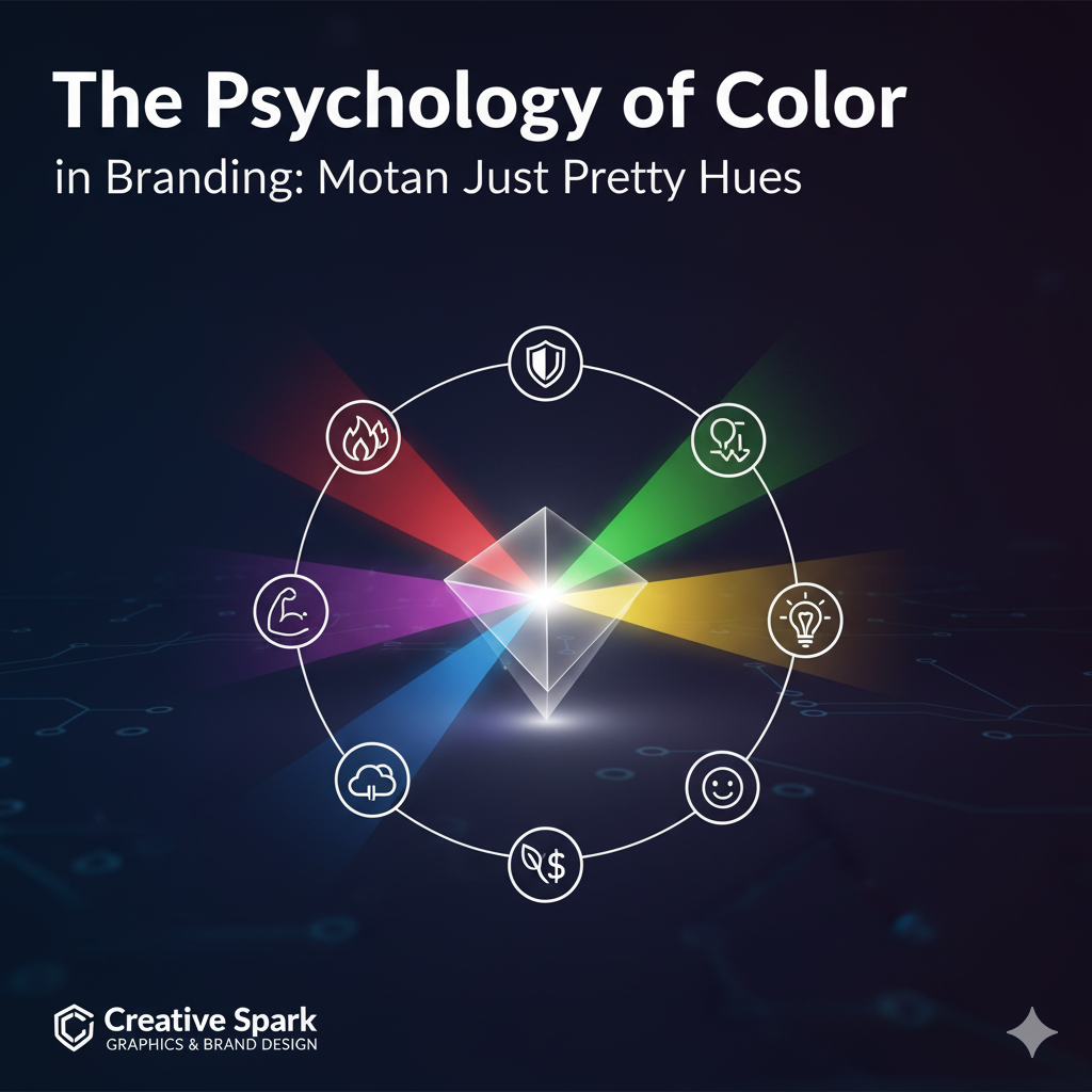
Different colours carry universal and culturally influenced meanings. Leveraging this understanding allows brands to communicate strategically with their audience on a subconscious level. Here’s a quick look at some common associations:
- Blue: Often associated with trust, reliability, stability, and professionalism (e.g., tech companies, financial institutions).
- Red: Evokes energy, passion, urgency, and excitement (e.g., food, entertainment, sales).
- Yellow: Symbolises optimism, warmth, happiness, and creativity (e.g., children’s brands, creative services).
- Green: Linked to nature, growth, health, and tranquillity (e.g., eco-friendly products, wellness brands).
- Orange: Represents enthusiasm, creativity, adventure, and friendliness (e.g., sports brands, creative industries).
- Purple: Often signifies luxury, sophistication, wisdom, and royalty (e.g., high-end products, beauty).
- Black: Conveys elegance, power, sophistication, and modernity (e.g., luxury fashion, professional services).
- White: Associated with purity, simplicity, cleanliness, and minimalism (e.g., healthcare, tech).
Strategic Colour Choices for Your Brand
Choosing your brand colours isn’t about picking your favourite hues. It requires strategic thinking that considers:
- Your Target Audience: What colours resonate with their demographics and psychographics?
- Your Industry: Are there established colour norms, and do you want to conform or differentiate?
- Your Brand Personality: Do you want to appear playful, serious, innovative, or traditional?
- Cultural Nuances: Be aware that colour meanings can vary significantly across different cultures.
Beyond Individual Colours: Combinations and Contrast
It’s not just about single colours, but how they interact. A well-designed colour palette uses primary, secondary, and accent colours to create visual harmony, highlight key elements, and ensure accessibility. Contrast is vital for readability and guiding the viewer’s eye.
Here, we delve deep into color psychology to craft brand palettes that don’t just look good, but strategically communicate your brand’s essence and connect with your audience on a deeper, more impactful level.